
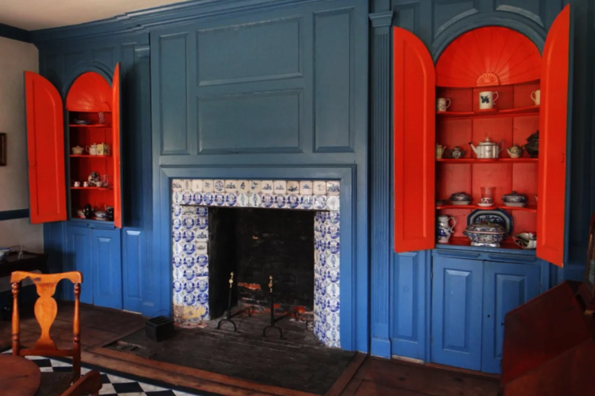


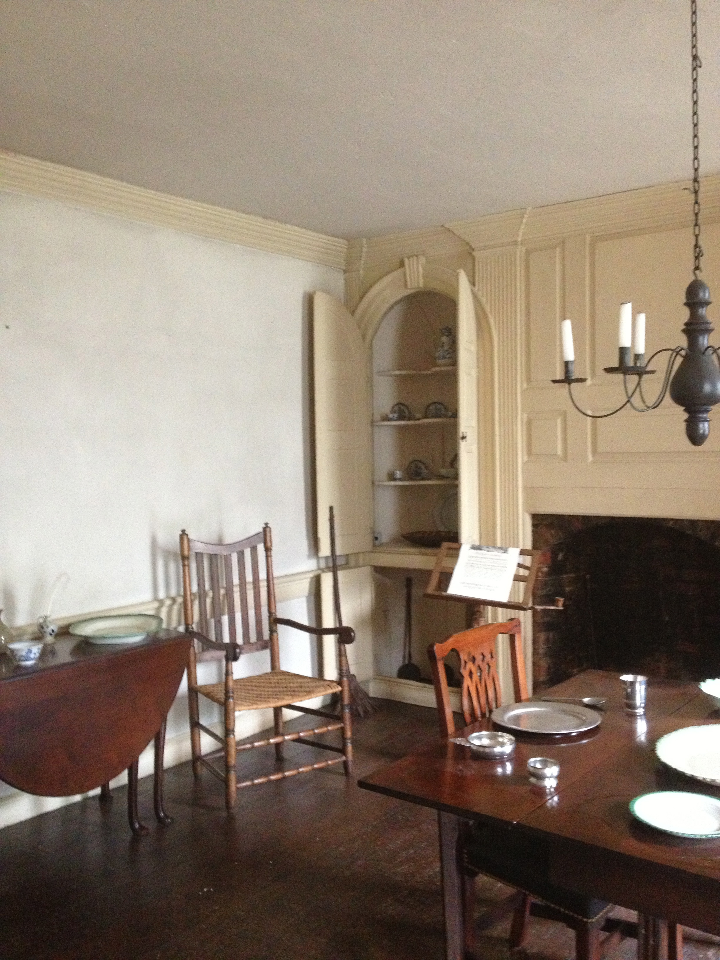
Croton-on-the-Hudson Historical House
it is the eternal lure of beauty which rules the world.
Candance Wheeler
Croton-on-the-Hudson Historical House
it is the eternal lure of beauty which rules the world.
Candance Wheeler
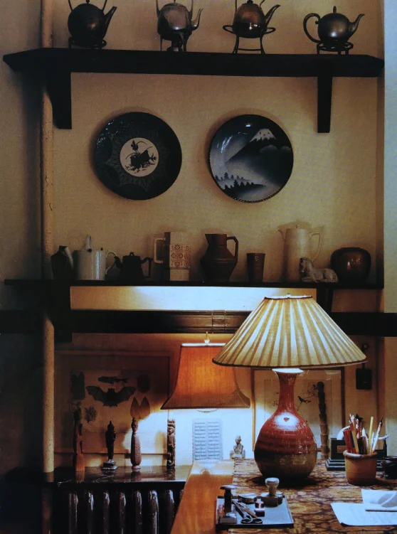
scale/proportion/volume
Interior Eye Candy
…for every bit of paneling, every lighting fixture, the placing of each mirror, was worked out so that the shell of the house and its furnishings might be in perfect harmony.
- Elsie de Wolfe
Interior Eye Candy
…for every bit of paneling, every lighting fixture, the placing of each mirror, was worked out so that the shell of the house and its furnishings might be in perfect harmony.
- Elsie de Wolfe
eye content
EYE CIRCULATION
eye content
EYE CIRCULATION
There are few things more satisfying than enjoying our home environment. To be able to walk through our door and have an, ‘Ah, I’m home.’ moment. Here are a few ways to bring that “Ahh” feeling home.
Did you know the eyes are the only visible part of us attached to our brain? Is this why we call them windows to the Soul?
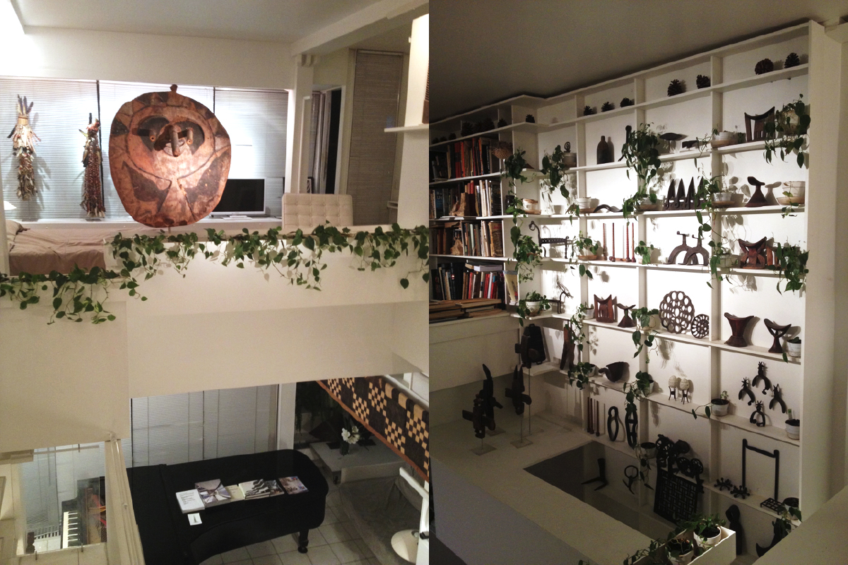
The eyes follow circulation, moving in a horizontal, vertical and diagonal direction. Stopped only by the objects in its path (like the period on this page). If only one of these directions is prominent in a room, then the room will lack visual stimulation. But add a vertical direction to a predominantly horizontal landscape and our eyes have a more satisfying way to survey the 'landscape'. With the addition of diagonal movement, which intersects the other two, you obtain a sustained visual interest.
Diana Vreeland
“The eye has to travel.”
The trick is to keep one's eye/brain moving the right amount so we feel content in a room without being over or under stimulated. We want our eye movement to be both stimulating and restful.
We don’t want the room to be so visually stimulating that our eyes are jumping around not sure where to land next which can cause brain fatigue.
To keep the rhythm and harmony, we set up a little dissonance and syncopation…to keep the interest - the edge.
In a room that works harmoniously with these 3 directions, your eye gets a chance to rest in the space between objects. Repose. When the scale of the objects and furniture and its placement around the room works, we have harmony. That’s what we come home for - especially if we live in a big city or have a stressful job and who doesn't?
Today’s modern apartments,where many of us dwell, have ceiling heights that only reach 8’. This is relatively low compared to pre-war apartment construction. Lower height gives us a whole different perspective. Molding is not as necessary, but no matter what height the ceiling is,we still need to have eye circulation around the room.
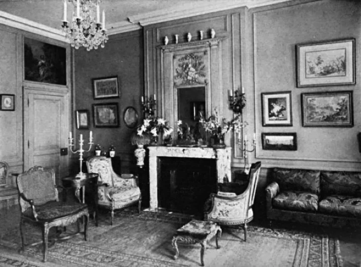
20th C Elsie de Wolfe Interior
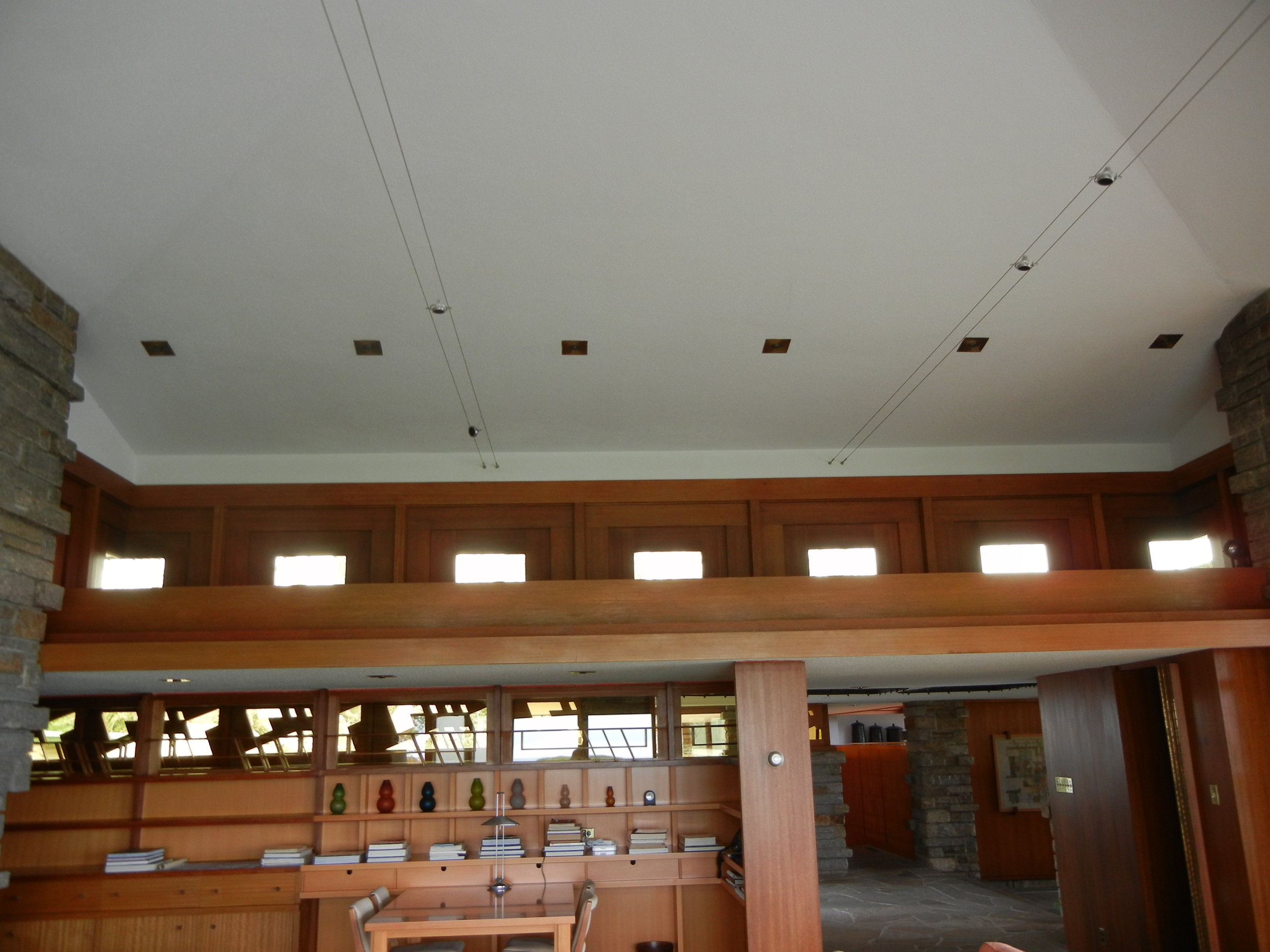
In early 20C the pioneers of interior design worked with certain principles when dealing with soaring ceiling heights. One such woman was Elsie de Wolfe She used wall molding to integrate the space, as seen from the photo below. She adorned her walls in this high ceilinged space with mirrors, light fixtures, art work and objects of visual interest so our eyes would move with the visual circulation.
20th C Elsie de Wolfe Interior
In early 20C the pioneers of interior design worked with certain principles when dealing with soaring ceiling heights. One such woman was Elsie de Wolfe She used wall molding to integrate the space, as seen from the photo below. She adorned her walls in this high ceilinged space with mirrors, light fixtures, art work and objects of visual interest so our eyes would move with the visual circulation.
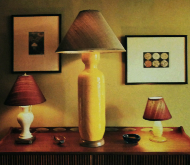
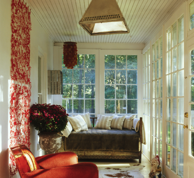
Here’s a more contemporary 20thC take on filling the space.
NEST Magazine, Hello to All That by LISA ZEIGER 1998
why do some designers look like they try so hard?
A 21C design publication (not shown here to protect the innocent) recently featured a renovation by a designer to the mega wealthy, showing both before and after photographs of a room. Why, I pondered, did the before photo look so much better?
Analyzing this I found this well known contemporary interior designer took out the original wall molding (ouch), which was most likely created by the architect who built this entire pre-war building. This wall molding was put in place by someone who understood proportions.
The beautiful bones of the building lay in these high ceiling and classical proportions that worked with the furniture and artwork, whereas this interior designer re-proportioned the moldings on the walls without a clue of how to fill them with the right objects.
And it didn't stop there. With each choice she made it was obvious she was trying too hard. The phrase sums up design that separates the men from the boys, trying too hard. Here is an example of so much time, money and resources thrown at a project that from the photos looks like it would have been better left alone.
I was recently invited into a renovation where the owners were respectfully honoring their past. Right here in midtown, on 57St of all places! I was elated. Here were the early stages of a gut renovation to a late 1800’s apartment that had not been renovated - ever. The apartment owners, along with the architect, were keeping rooms with their beautiful ceiling and wall moldings, original stained glass windows, fireplace details, stair trends and railings. All were being kept intact.
Parquet floors, although they would no longer be continuous where layouts and plumbing were altered, would be covered …that’s where I came in. The renovation was exhilarating to see in progress. New owners being respectful of their past.
the power of 3 Cameron Cristoper Worthlan
Use diagonal elements in a room to move the eye.
A trick to moving the eyes is to use subordination of quantity so the room does not look stagnant, contrived or boring. What does this mean? Not everything need be even or equal. In short, there's more of one element and less of another. That's simple!
Another element which is often overlooked is to take 2 similar elements; in size, color or shape, and then pull in a 3rd that contrasts with the other 2, to create sustained visual interest. The power of 3 in disproportional amounts. My teacher, Rudolph Schaeffer, founder of the California Arts and Crafts Movement, would often reference this concept in his lectures and critiques.
/diagonal direction/


Harmony
HARMONY HEALS
Harmony
HARMONY HEALS
It takes harmony and proportion to make a room sing. Proportion of the room's ceiling height to the size of room as well as the proportion of objects and furniture to the room.
Living in a harmonious atmosphere creates a feeling of well being and, conversely, feeling out of harmony with one’s surroundings can bring one to tears. Here is an example.
One evening, soon after my daughter got her first apartment, I received a call from her in distress because she found that when she bought her first ever mattress it was too big for the bed frame and sheets. She was in tears. I asked her to check the size. Because of her great anxiety she thought she read that they were the same measurements but then with the morning light she found they were mismatched. Mystery solved – but not before having a miserable night.
It is within our reach to create our own beautiful and ‘picture perfect’ interior. Is this restful interior we strive for not a substitute for nature’s restful beauty which we lived unprotected by eons ago? To protect ourselves from these harsh elements we built shelters that became ever more complex. Yet no matter how far we move away from nature, it's impression lives deep within our psyche.
If you see a room that lacks these qualities, but cannot quite put your finger on what is off, you might ask yourself what you don’t like about it. I find that it is just as important to analyze what you don’t like as it is to analyze what you like about something.
What makes you feel uncomfortable? Is there one thing or many out of place? Is there disharmony in color, a sense of disproportion of objects to the room? How does one object relate to another? Make notes on how you can improve it? You might want to sketch your changes.
When Elsie de Wolfe decorated, she tried to unify her space, using all aspects of the room, tying-in the upholstery to the paint, to the curtains.
Scale Proportion Volume equals Harmony. Albert Hadley was a master of it. Who else could have taken a cold cavernous space with floor to ceiling windows that looked out on a modern, almost foreboding architecture and make the room feel and look completely harmonious within these surroundings?
This task could not have been accomplished if he hadn’t nailed color and texture as well as scale, proportion and volume.
From Elle Decor magazine
nature's impression lives deep within our hearts
Frank Gehry, Frank Lloyd Wright
Frank Gehry’s architecture deviates from the traditional boxy architecture of the past 60 years.
Could his rhythm be what elevates the spirit?
Frank Gehry, Frank Lloyd Wright
Frank Gehry’s architecture deviates from the traditional boxy architecture of the past 60 years.
Could his rhythm be what elevates the spirit?
drama in the Differences
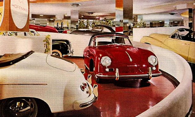
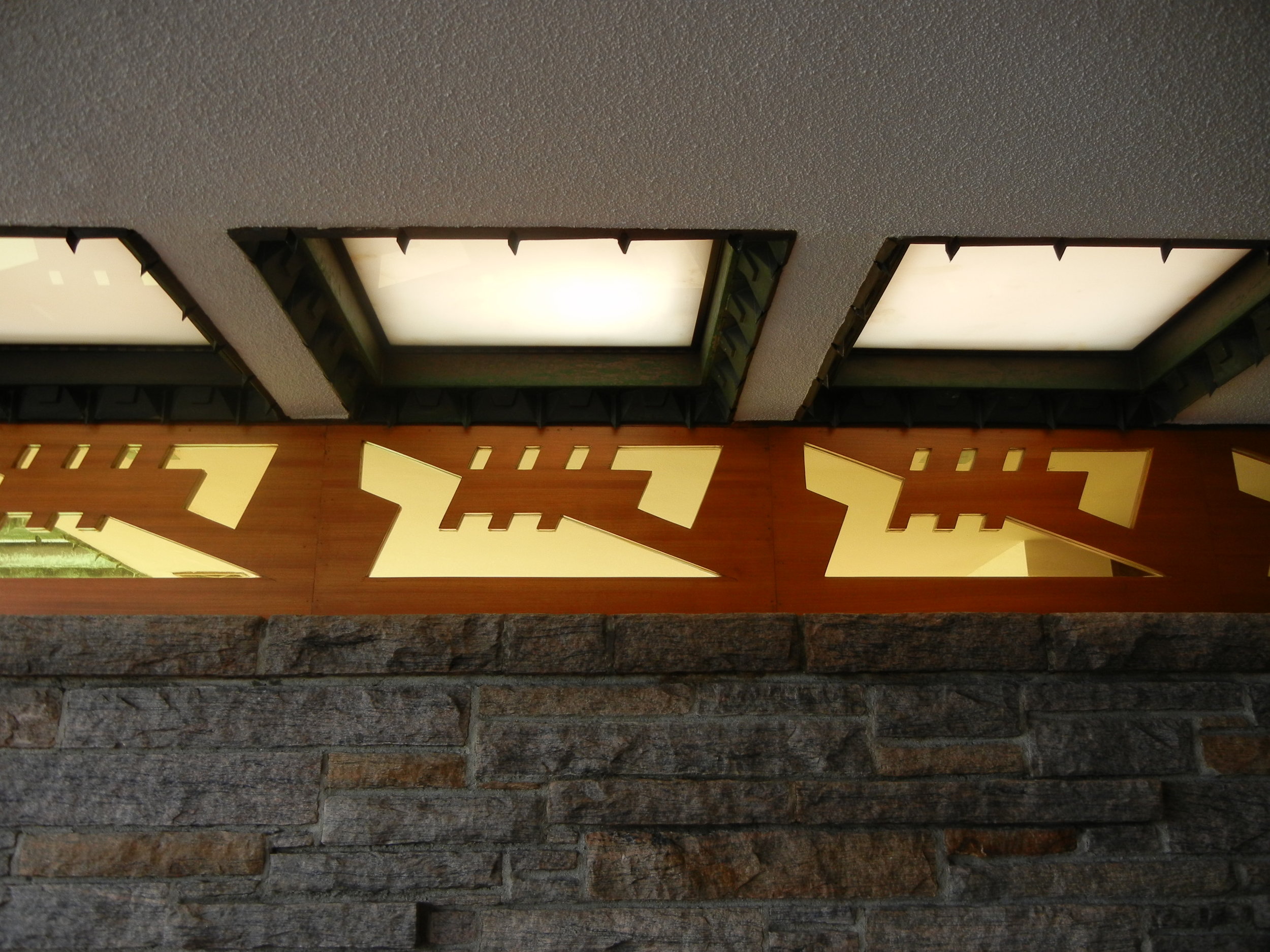
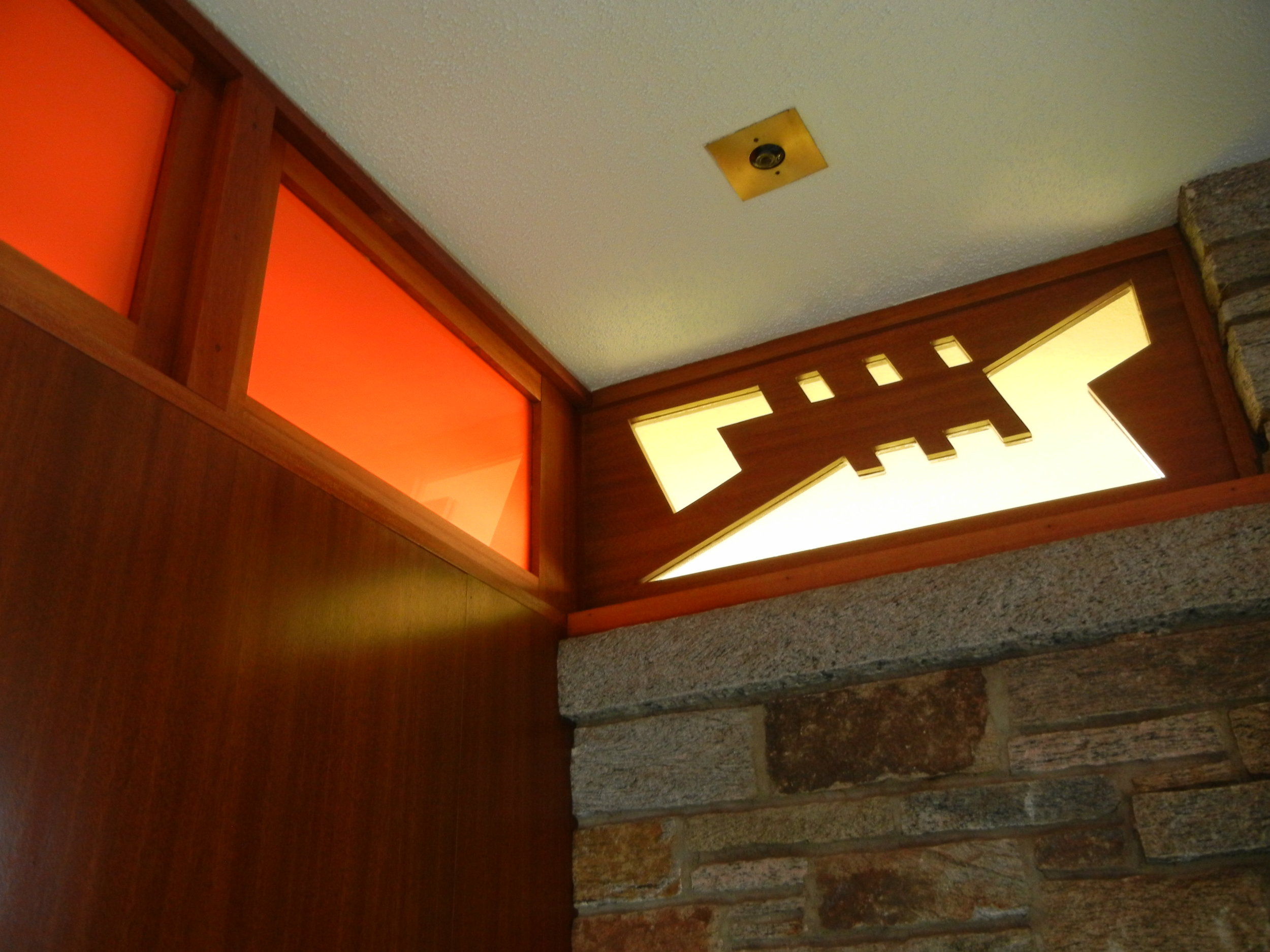
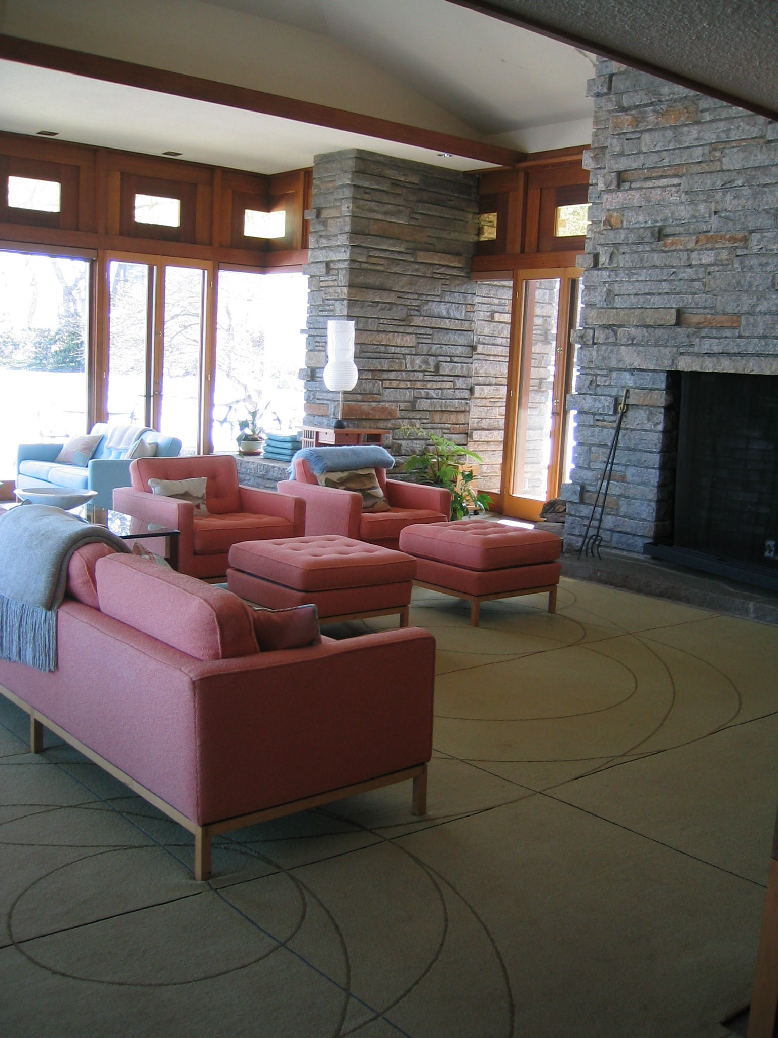
Frank Lloyd Wright, considered one the giants of 20th Century architecture, seemed to have a formula for keeping us engaged within his space. He designed a house in Rye, NY for Max Hoffman, the owner of the first Mercedes Benz dealership in the United States. The showroom on the corner of 56 St and Park Ave stood for over 50 years and just recently got destroyed after the owners were contacted by the Landmarks Commission that their building was being considered for landmark status - boo! The showroom’s car ramp, designed by Frank Lloyd Wright, was a test drive, so to speak, for the vast interior ramp at the Guggenheim Museum.
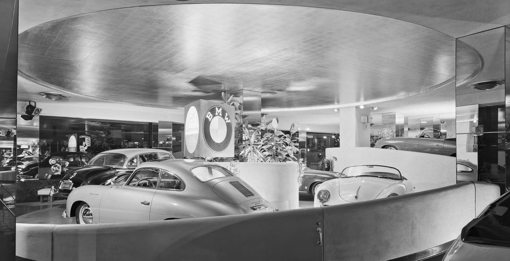

In this home Frank Lloyd Wright designed for Mr. Hoffman, where I had the good fortune to make many of the carpets and area rugs, an interesting pattern to the house emerged. Mr. Wright made the entryway ceiling height very low and the walkway narrow. Bordering on claustrophobic and dimly lite, was the build-up to a surprise when I emerged from the narrow and low and dark into a vast and light filled living room with double high ceilings.
IAC
FRANK LLOYD WRIGHT HOUSE RYE, NY
emerging from under the eaves
IAC
FRANK LLOYD WRIGHT HOUSE RYE, NY
emerging from under the eaves
On Beauty
I recently came across a Jewish prayer at a local synagogue:
We pray to stand upright, we fallen; to be healed, we sufferers.
We pray to break the bonds that keep us from the world of beauty.
We pray to be open to our own true selves.
We pray that we may walk in the garden of purpose, in touch with the power of the world.
As Candance Wheeler said,
“it is the eternal lure of beauty which rules the world.”
When we consider what makes a space beautiful we find that hidden beneath the surface is scale, proportions and volume.
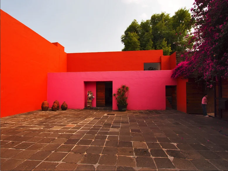
Luis Barragan Home
It is alarming that publications devoted to architecture have banished from their pages the words Beauty, Inspiration, Magic, Spellbound, Enchantment as well as the concepts of Serenity, Silence, Intimacy and Amazement. All of these have nestled in my soul, and though I am fully aware that I have not done them complete justice in my work, they have never ceased to be my guiding light.
- BARRAGAN speech when accepting his Pritzker Prize
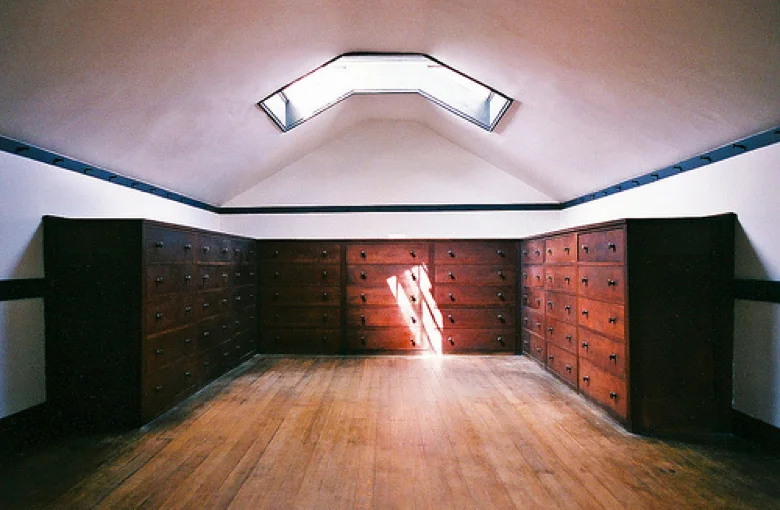
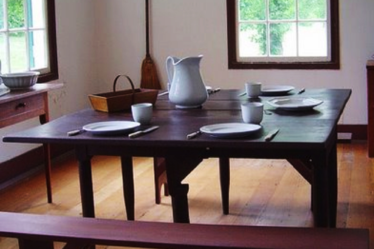
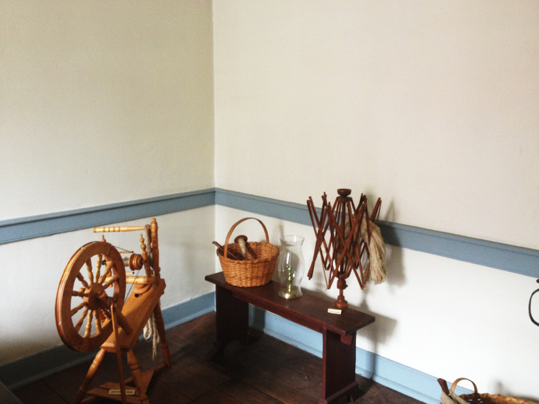
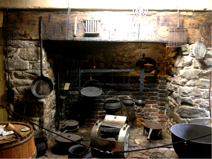
The Shakers Interior
The Shakers - masters of simplicity.
Their simple unadorned surroundings reflected their interior spiritual space and devoted religious nature.
The Shakers Interior
The Shakers - masters of simplicity.
Their simple unadorned surroundings reflected their interior spiritual space and devoted religious nature.


Nakashima and Isamu Noguchi were both influenced by the Japanese concept of MA – the void or space that is volume.
On the Opposite End of the Spectrum…
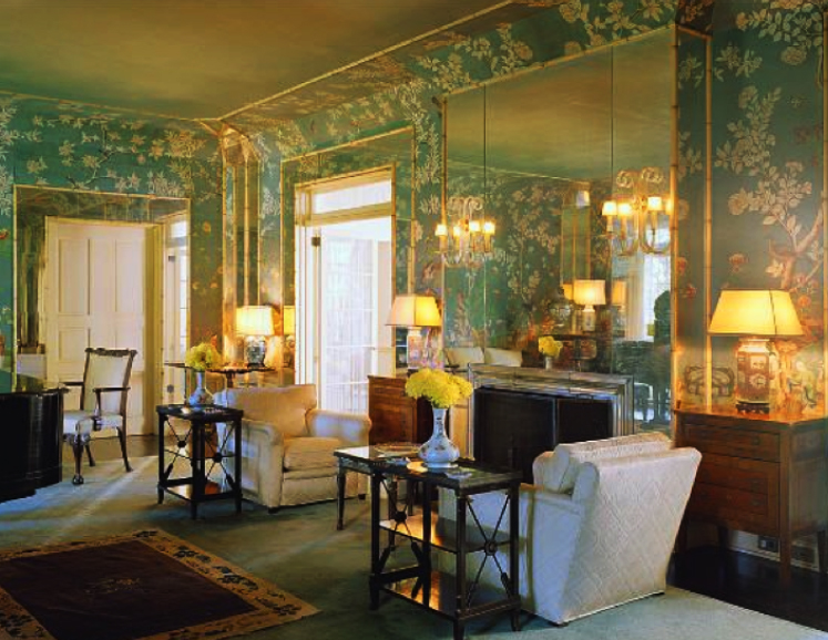
Mark Hampton layered interior
Mark Hampton’s rooms embrace a specific opulent style that is the complete opposite of the quiet atmosphere developed by Nakashima, Noguchi, early American aesthetic of the Quakers and Shakers settlers and the Scandinavian simplicity. However, I don’t think anyone has used fabric so effectively to circulate the eye around the room.
Stefanidis Interior
With his sheer opulence
Stefanidis is another master of eye circulation.
Stefanidis Interior
With his sheer opulence
Stefanidis is another master of eye circulation.
A nod to the NOVOGRATZ. Can you imagine this room without the wall hanging?
The wallhanging not only adds color, pattern and texture - it also leads our eye in a vertical direction. This one piece adds so much. The next time you see a room that you think is interesting, make a mental note of the elements that give it interest. And if you're looking at a photograph, as above, then play a game of placing your hand over the wall hanging to see how different the place would look without it.