
Here’s a more contemporary 20thC take on filling the space.
NEST Magazine, Hello to All That by LISA ZEIGER 1998
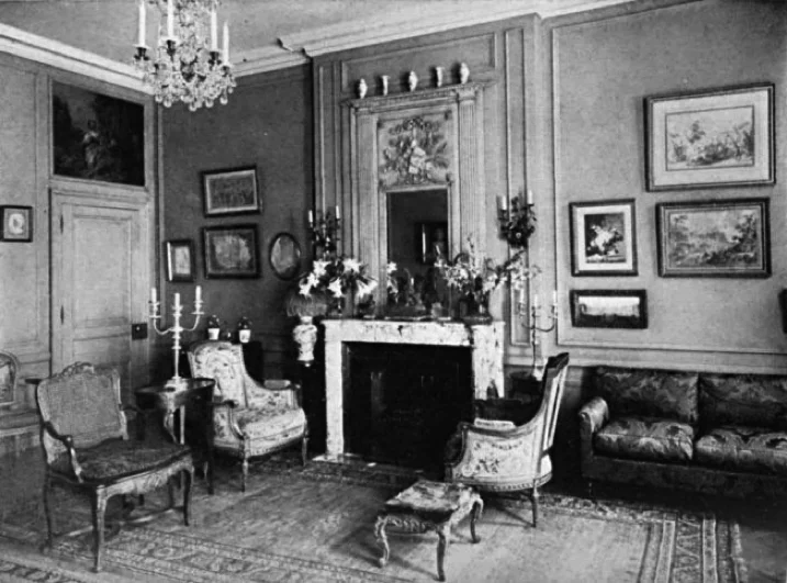
why do some designers look like they try so hard?
A 21C design publication (not shown here to protect the innocent) recently featured a renovation by a designer to the mega wealthy, showing both before and after photographs of a room. Why, I pondered, did the before photo look so much better?
Analyzing this I found this well known contemporary interior designer took out the original wall molding (ouch), which was most likely created by the architect who built this entire pre-war building. This wall molding was put in place by someone who understood proportions.
The beautiful bones of the building lay in these high ceiling and classical proportions that worked with the furniture and artwork, whereas this interior designer re-proportioned the moldings on the walls without a clue of how to fill them with the right objects.
And it didn't stop there. With each choice she made it was obvious she was trying too hard. The phrase sums up design that separates the men from the boys, trying too hard. Here is an example of so much time, money and resources thrown at a project that from the photos looks like it would have been better left alone.
I was recently invited into a renovation where the owners were respectfully honoring their past. Right here in midtown, on 57St of all places! I was elated. Here were the early stages of a gut renovation to a late 1800’s apartment that had not been renovated - ever. The apartment owners, along with the architect, were keeping rooms with their beautiful ceiling and wall moldings, original stained glass windows, fireplace details, stair trends and railings. All were being kept intact.
Parquet floors, although they would no longer be continuous where layouts and plumbing were altered, would be covered …that’s where I came in. The renovation was exhilarating to see in progress. New owners being respectful of their past.