

I began to wonder if “landscaped” color discussed in the previous section is relevant today or if it’s become an outdated concept. What I found is that we have come to expect even bolder statements of color in our rooms augmented by light flooding in post WWII construction, a variety of artificial (electric) lighting and artificial (aniline) pigments.
Though there’s recently been a more eclectic approach to design, which includes earthy tones and less plastic forms than in the 60’s, courageous color is still a key to bringing disparate elements into unison. Whether earthy, bold or a combination of both, we all want to live with the right color notes. Like a symphony playing in the background of our lives.
60's "hopeful" furniture
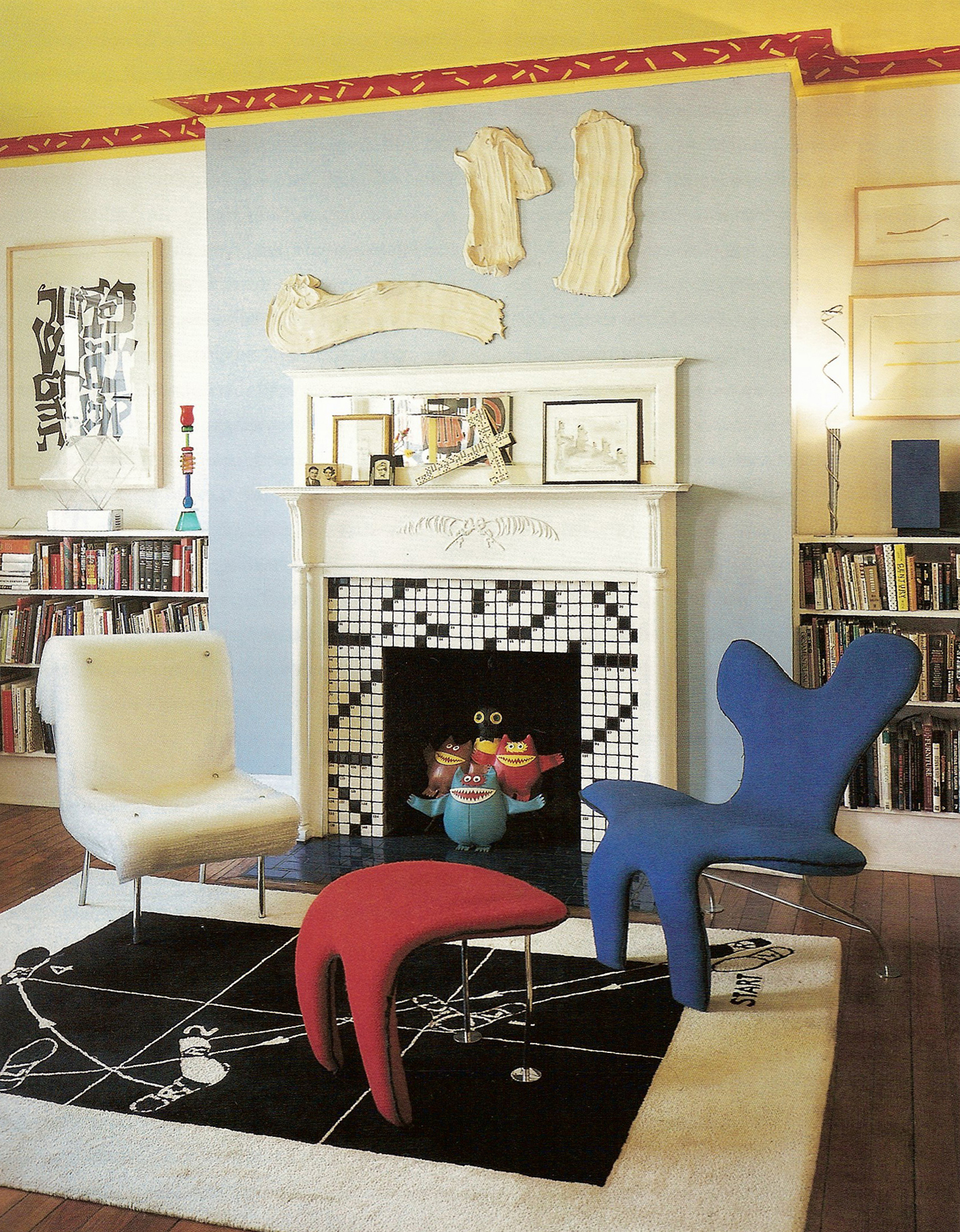
I once asked a client of mine who has become a friend why she collected some of the most iconic furniture pieces of the 60’s. She said she collected them because it was a hopeful era, a time when people were looking to the future and seeing infinite possibilities. (Moon landings anyone?)
Her pieces reflect fiercely bold colors with lines that don’t cry old world Biedermeier and Chippendale but are ‘futuristic’ in shape.
Jenette Kahn, In Your Space
The pieces she bought at auction are collectibles. But over time one of the couches synthetic foam began to disintegrate. It had been filled with what was then new - a polyurethane foam. No one had any idea of its ‘shelf life’.
Something to consider when buying used furniture is to know what the piece is made of on the inside. We buy what we love, without realizing it may have structural shortcomings.
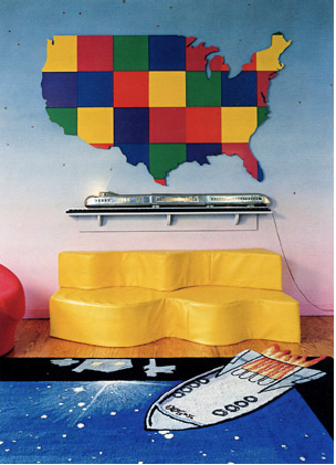
Whether we like a bold or subdued color palette, we can play with peppering the floor, ceiling, furniture or artwork with bold accents. If we want a colorful piece of furniture to stand out, then it’s fun to paint furniture what we already have or a flea market find that might be old, stained or chipped. We can give it a coat of our 'must have' color. If not on the furniture how about placing a large block of color on one of the walls. Extra awall color and attention can be gotten from wallpapering or placing a painting on it. If we keep the walls, ceiling and floor as a neutral backdrop it nicely counter-balances the piece of artwork that pops to center stage.